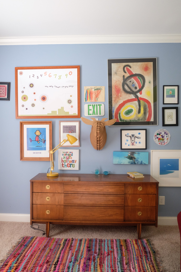
I recently had the pleasure of sampling paint color from Aphrochic’s Brooklyn in Color paint collection with Colorhouse. The paint collection is a low odor and superior performance, eco friendly line of paints which is usually a prerequisite for me and the paints I work with, but especially now because I am expecting.
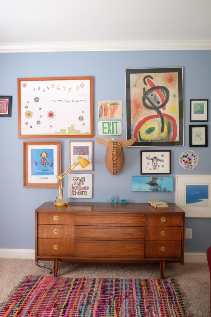
photographer of this pic : Lea HartmanI decided to choose the paint color, Navy Yard from the Aphrochic collection to use an accent color on this wall of art. Above is a before pic for reference.
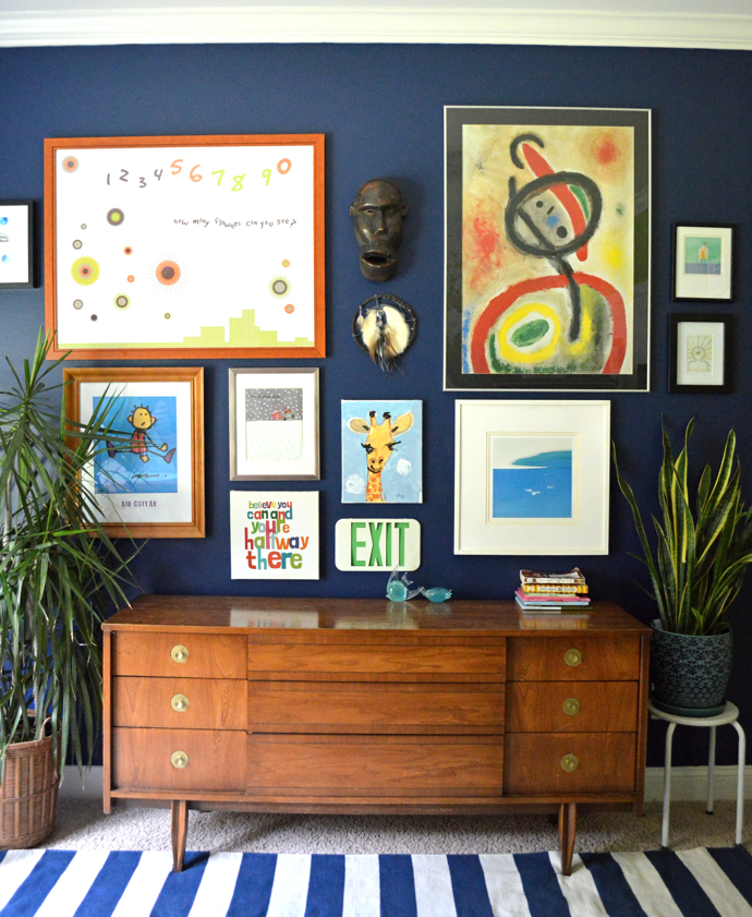
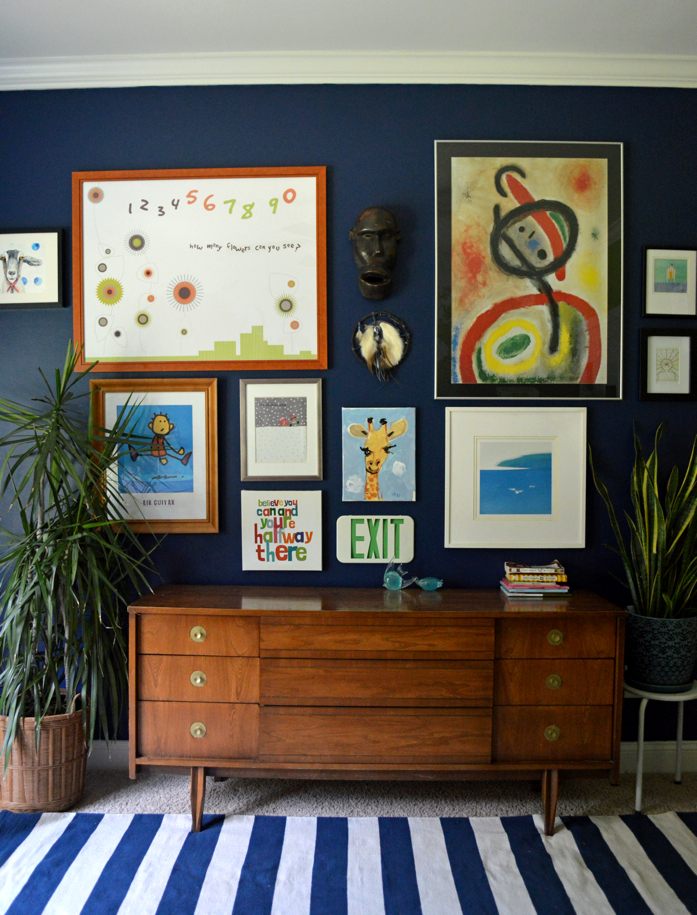
However, although I was drooling over the color because it’s an absolutely gorgeous color, I had to make sure it work in the space as it is. These existing aesthetics traits that already existed in the room definitely sealed the deal:
The white trim: The existing white trim would allow the navy to pop and we all know navy and white is a classic color combination.
The furniture: I was actually day dreaming about the brown mid century dresser against the navy wall before I even painted it. I just knew it would work because brown and navy is such a delicious combination!
Art: All the art from the gallery wall would undoubtedly pop against the navy and it sure does
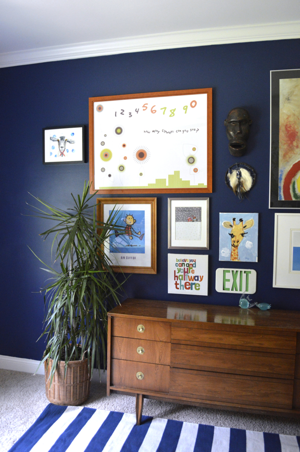
Since it is such a deep color, I had to apply almost 3 coats to ensure even coverage, but the paint was a joy to work with. I loved how smooth it was. Also depending on the time of day, it could almost pass as black. I am very pleased with how the results. xx
