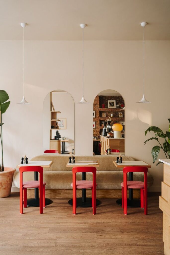
Have you ever designed a space and felt like something was still missing…? Well, maybe you needed to add a bit of red. By now, you’ve probably heard about the unexpected red theory that has taken over the interwebs.
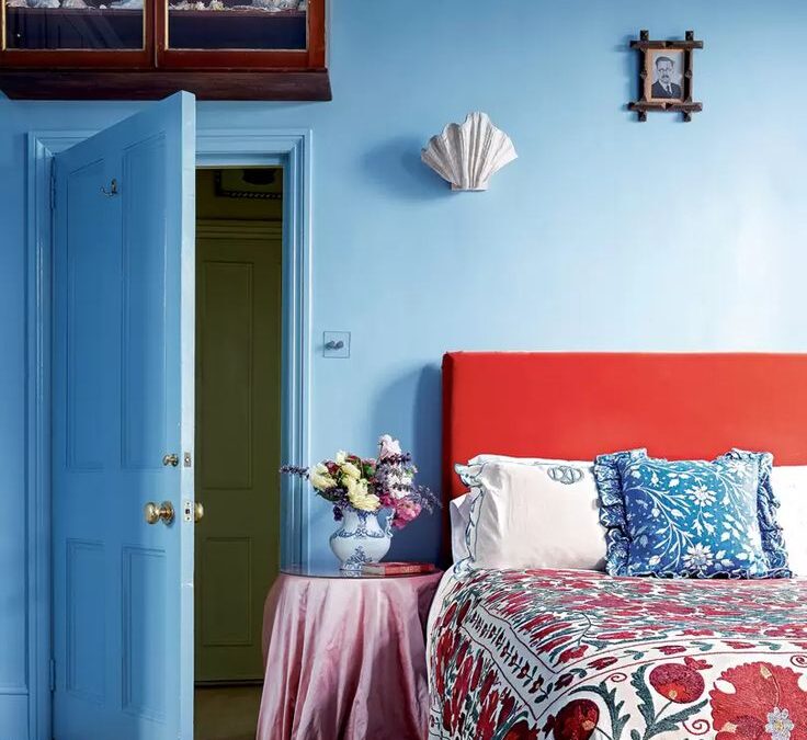
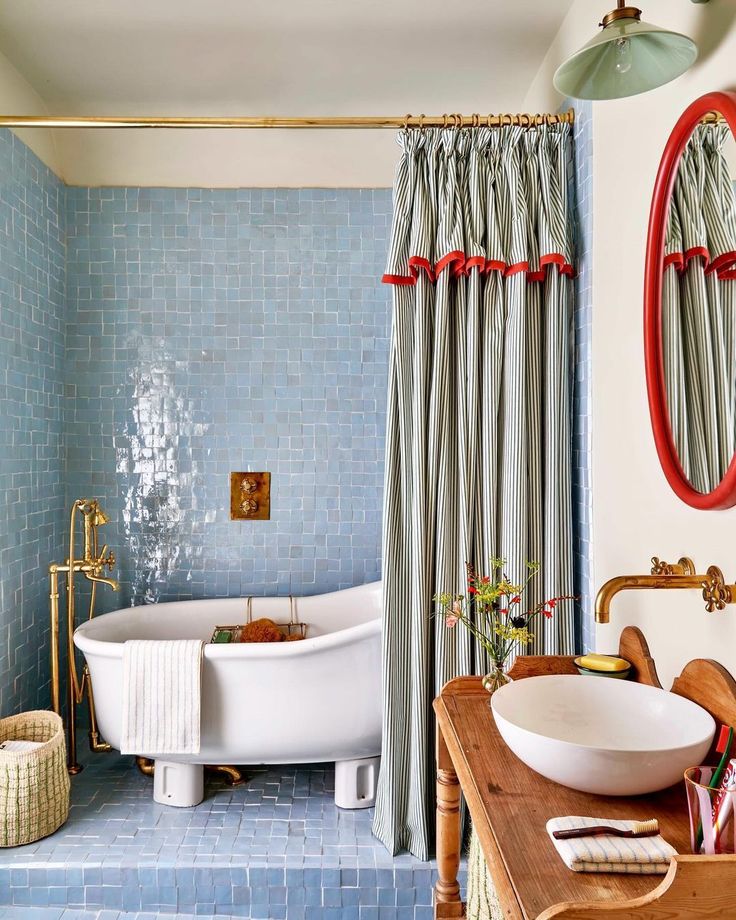
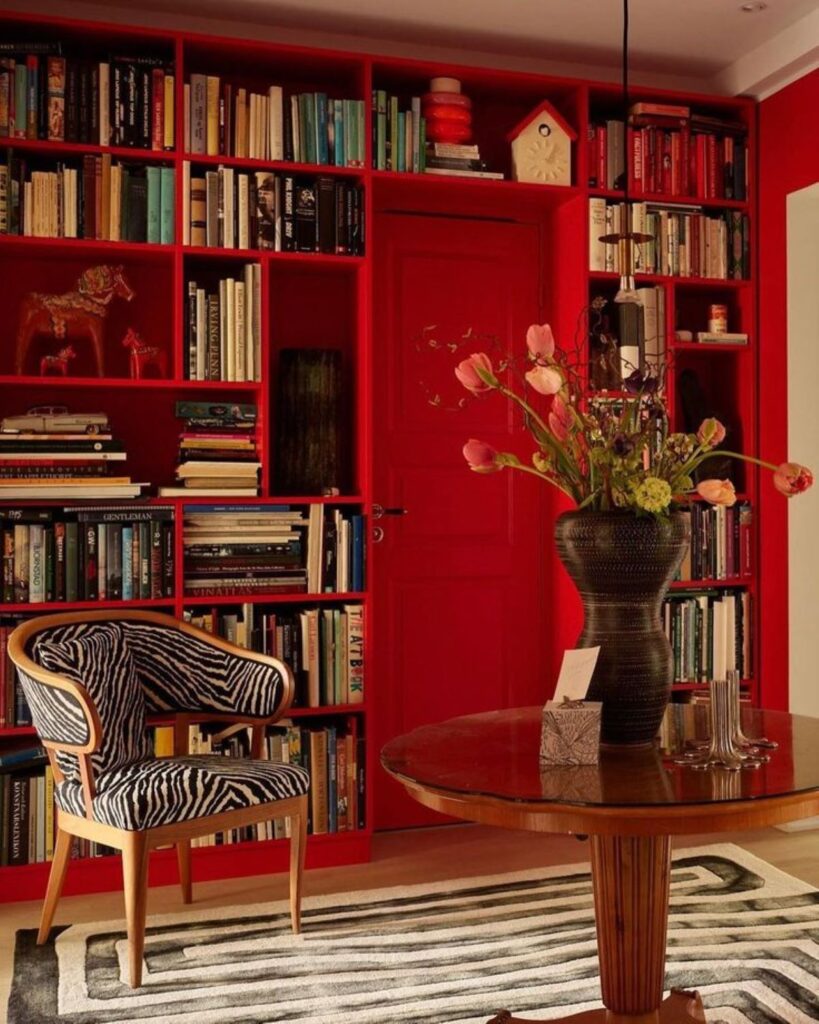
According to designer and ticktocker , Taylor Migliazzo Simon who garnered over a million views on her ticktock video, “the unexpected red theory is basically adding anything that’s red, big or small, to a room where it doesn’t match at all, and it automatically looks better,”
The unexpected red theory in interior design emphasizes the power of color psychology and strategic design choices to evoke emotional responses, create visual interest, and shape the perception of a space in surprising and unconventional ways. Enjoy this roundup of 21 spaces that effortlessly incorporates the unexpected red theory. The above image is by one of my faves; Lonika Chande. I love her use of color!
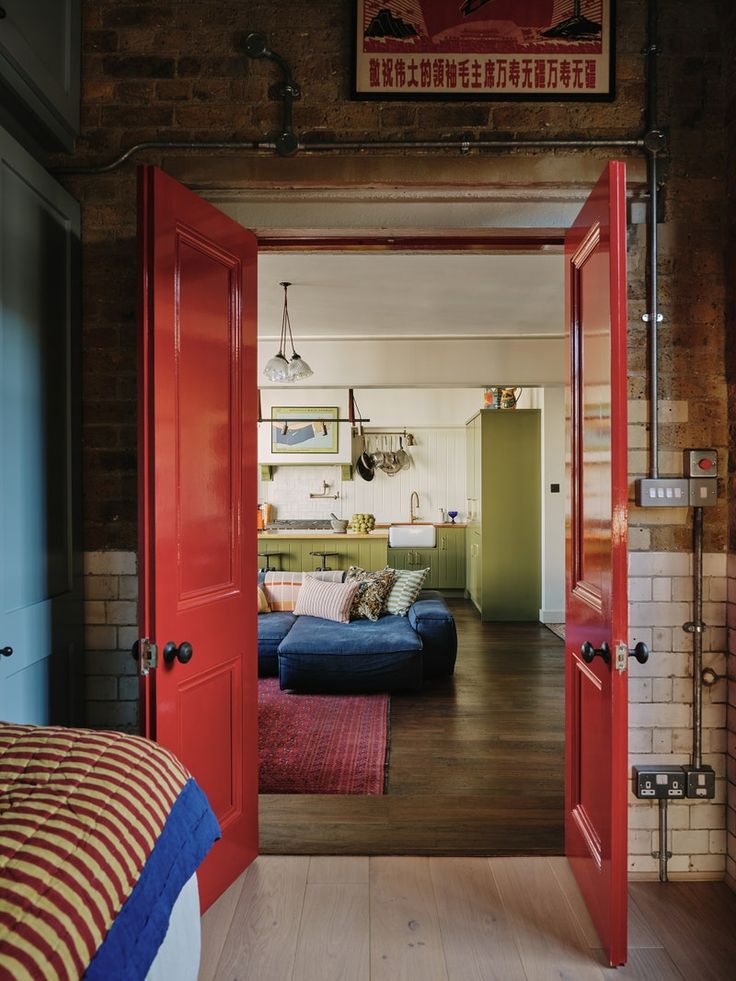
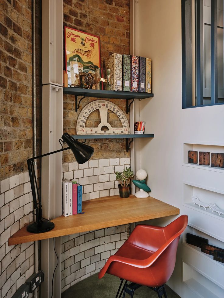
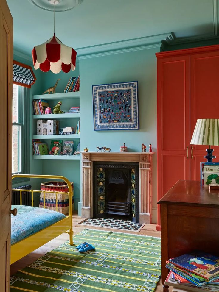
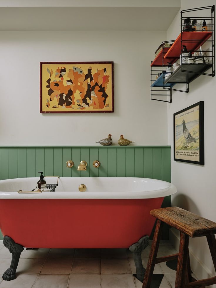
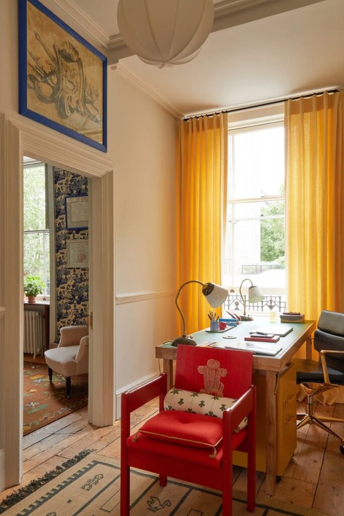
designed by Beata Heuman
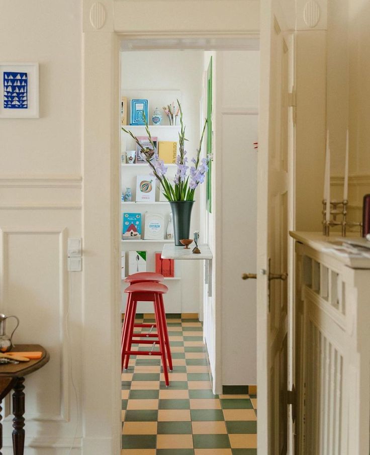
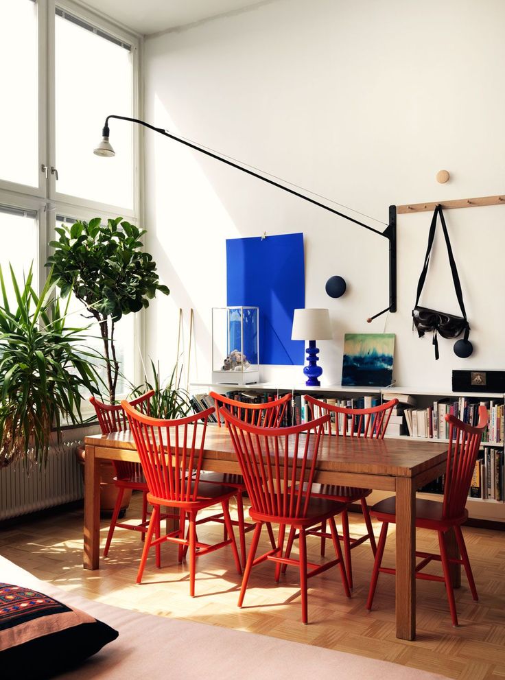
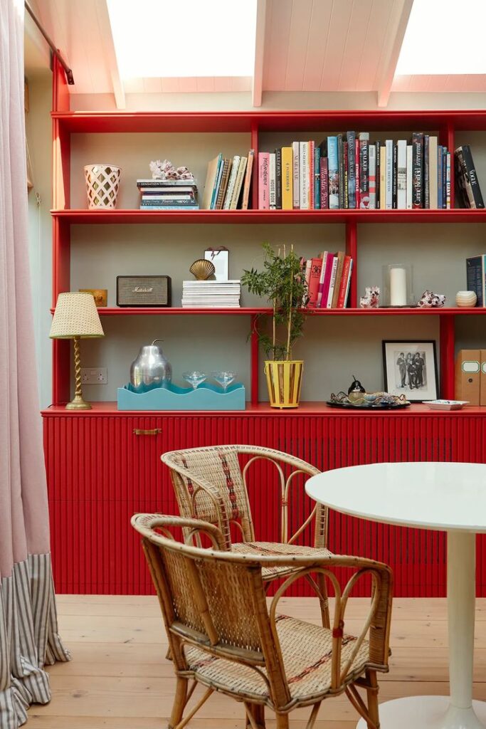
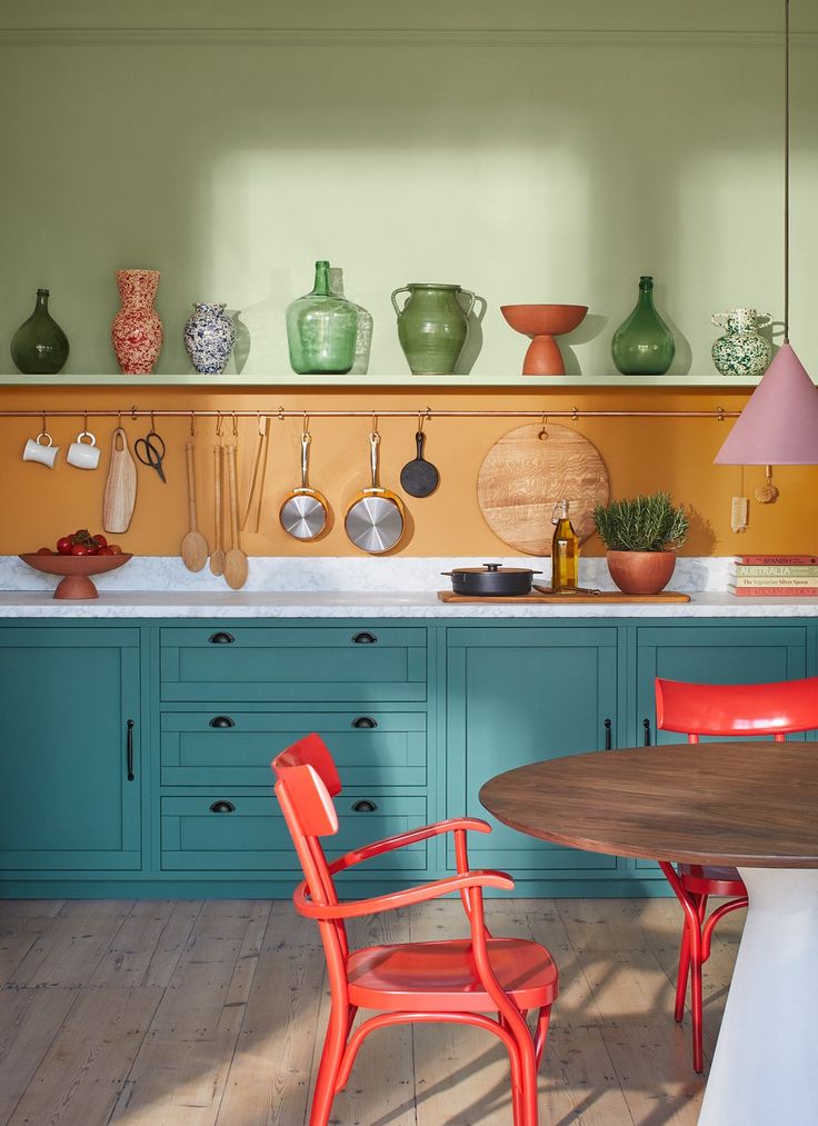
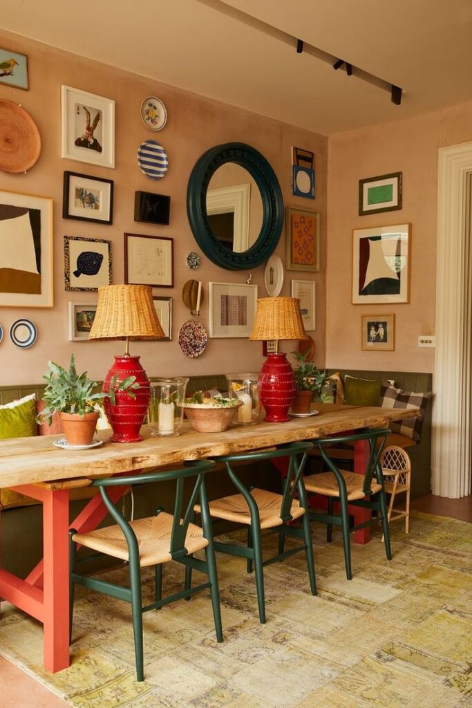
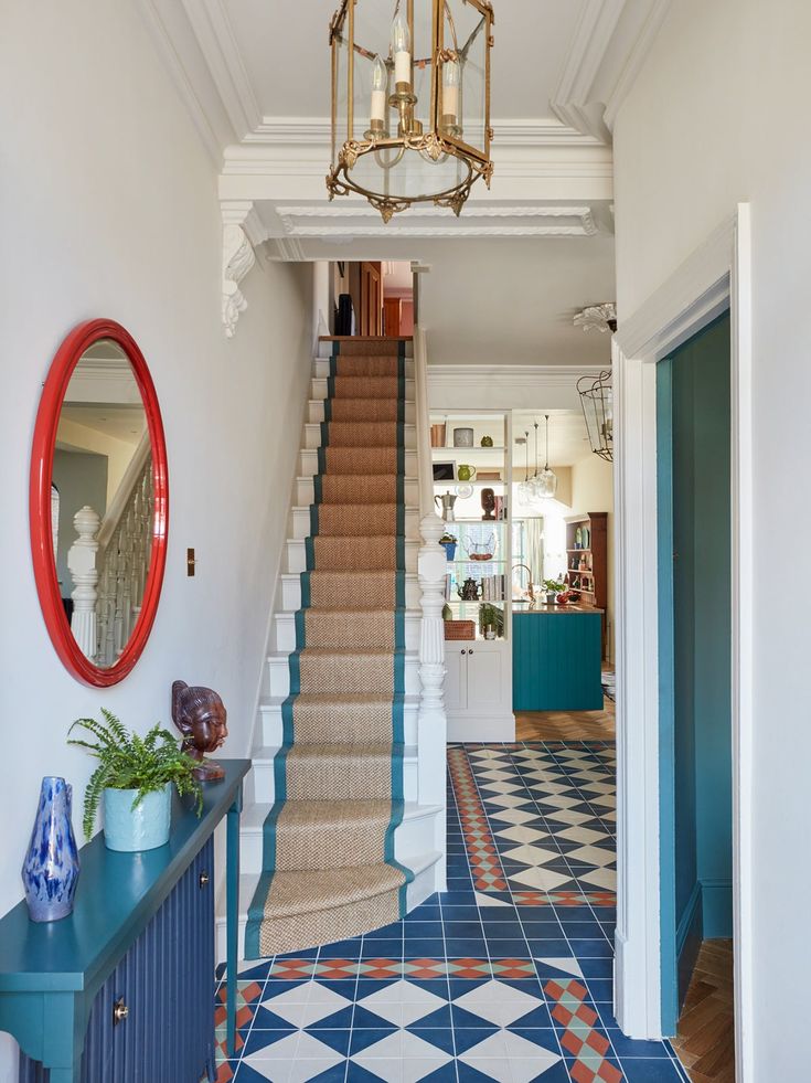
source
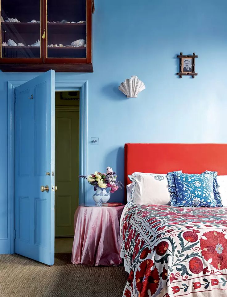
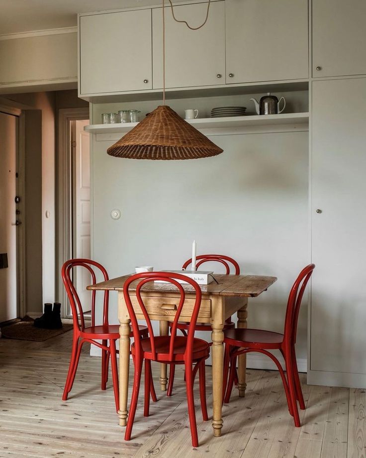
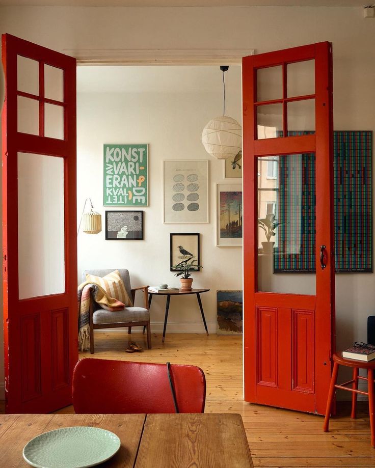
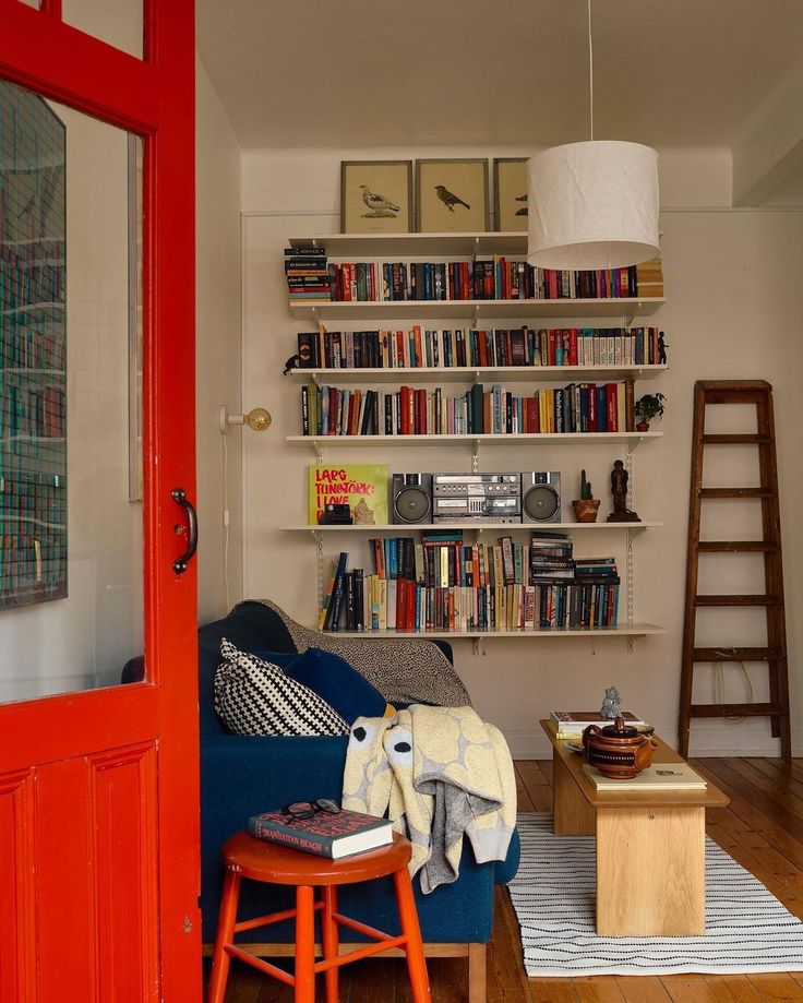
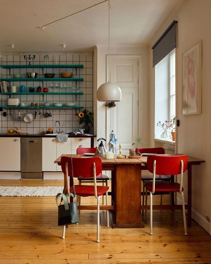
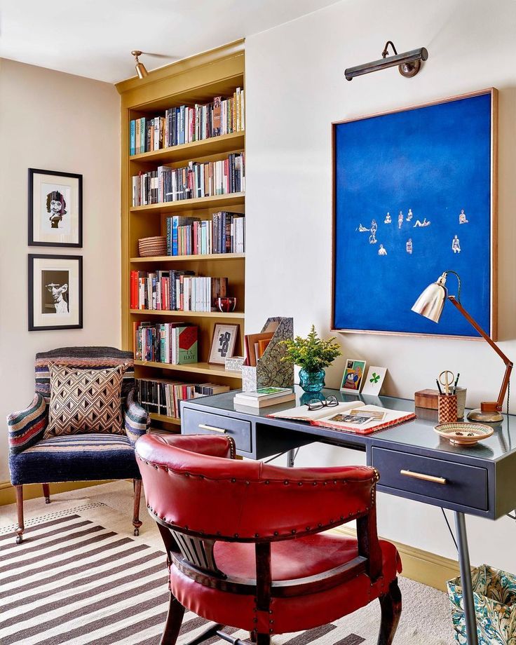
Designer-Lonika Shande -Photographer-Milo Brown Photography
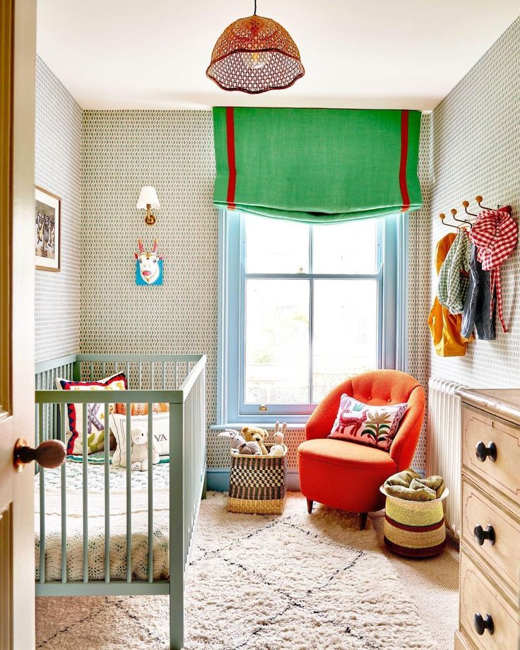
Designer-Lonika Shande -Photographer-Milo Brown Photography
Do you have a bit of red in your spaces? I actually went looking around our home and actually found some existing red moments. And they do add a a bit je ne sais quoi to the space. xx
